
Wednesday, January 16, 2013
Haunted House - Final

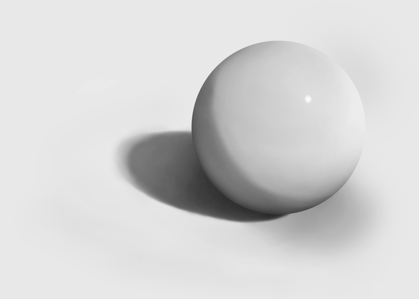
Sphere - Final
Windows Vista Aurora Effect
Tutorial: http://www.tutorial9.net/tutorials/photoshop-tutorials/creating-the-windows-vista-lighting-effect/
 |
| Original image [I chose this image because it has a lot of color which adds to the end result] |
First I applied a very significant Gaussian blur to the photo. Second, I changed the levels and stopped when I was satisfied with this purplish blend. To make the bands of light, I used the elliptical selection tool to make a selection and then colored in the edge with white using a large brush on 0% hardness. Finally, I rotated it until satisfied and repeated that process until I felt I had enough bands of light. I like how it turned out - very simple, yet very cool.
 |
| Final |
Tuesday, January 15, 2013
Colorful Swirl
Tutorial used: http://phonuts.org/tutorials/special-effects/colourful-swirl/
This is a really cool and simple effect in my opinion. While doing this I realized that I am getting extremely comfortable with Photoshop and it is getting smoother and easier to translate ideas in my head directly down to the program.
 |
| Start with clouds. |
 |
| Pixelate. |
 |
| Use radial blur of 100 twice. |
 |
| Twirled 120 degrees. |
 |
| Layer duplicated, twirled -180 degrees and blending mode turned to lighten. |
 |
| Changed the hue of both layers. |
 |
| Final result |
Friday, January 11, 2013
Space Lighting FX
Tutorial used: http://abduzeedo.com/space-lighting-effects-10-steps-photoshop-tutorial
I had some trouble with getting this one to look decent, but once I took my time and paid real attention to the instructions it wasn't that bad. I decided to make a 'Z' for my name. It's crazy how people can come up with designs like this. I guess they just might do some random things, see what turns out, and learn from it.
 |
| I started with a black background and added a soft radial gradient peeking over the top. |
 |
| Here I created a new black layer and added RGB lights (Filter > Render > Lighting Effects > RGB Lights) |
 |
| ...now with Gaussian blur. |
 |
| Another black layer was added on top with the blending set to Screen. Small stars were added here by adding Noise and altering the Levels so that only the desirable amount of specks of white were left behind. |
 |
| Now clouds were added to give a nice texture and a more gas-like appearance. Also, the color of the stars was changed to a colorful spectrum using a gradient. |
 |
| The lens flare was added to give a nice illuminating effect. Now it really starts to look like a colorful space nebula. |
 |
| To make the letter Z, I started with new layer. Then I painted in white, using a large brush on 0% hardness. Afterwards, I chopped it down on the side to create a clear line. Next step was to simply duplicate, rotate, and resize as necessary to create the Z. Done! |
 |
| Final (for some reason the stars don't look the same as in the PSD file...) |
I had some trouble with getting this one to look decent, but once I took my time and paid real attention to the instructions it wasn't that bad. I decided to make a 'Z' for my name. It's crazy how people can come up with designs like this. I guess they just might do some random things, see what turns out, and learn from it.
Monday, January 7, 2013
Sphere Update 2

Tuesday, December 18, 2012
Sphere Update 1

Color Blending


Using the brush on very low flow (1-5%) and a little bit of a lowered opacity (60-80%) I was able to blend the colors efficiently. I overlapped the colors and selected the resulting color in the middle to blend and continued with that process.
PS. It looks a lot better than this. The files must have lost some quality when converted to jpeg.
Brushes

Sphere

Brushes

Monday, December 10, 2012
Brushes


Friday, November 30, 2012
One Point Perspective Room

Wednesday, November 28, 2012
One Point Perspective Room

One thing I would like to mention is that it definitely helped me understand how to create real life 3D scenes that have depth to them.
Monday, November 26, 2012
One Point Perspective

Here is an example of one point perspective photography with a vanishing point. The horizon is shown in green. The natural lines of the photo leading to the vanishing point are shown in red. The vanishing point is shown in blue and seemed to be where the lines intersected.. The vertical lines are the rulers shown in light blue (I used the end of the bridge support beams and the end of the trees).
Tuesday, November 13, 2012
Haunted House Update 4
Today I continued to work on making the house look more run down, focusing on windows and shutters.


Wednesday, November 7, 2012
Haunted House Update 3


Animated GIF


 Here is the animated .gif I created of a flying bird along with the original image used. It was really easy and quick to do. I first edited out all the numbers and separated each frame into separate layers. Then I opened up the animation editor and put each separate frame in. Finally, to make it look natural and smooth I set the the time that each frame is shown to 0.1 sec and then saved it as a .gif image.
Tuesday, October 23, 2012
Haunted House Update 2


Wednesday, October 17, 2012
Haunted House Update 1


Subscribe to:
Posts (Atom)